On a web page, users only take the time to read 28% of the words at best.
They scan the pages looking for what they need. So how can you make sure information stands out? How can you encourage your visitors to read more?
Our reading behavior is not yet adapted to on-screen reading. Results show that it takes 25% more time to read something on a screen than it does on paper. Consequently, information has to be presented differently on the Internet to make it more readable.
Using color
Does color improve user performance? Actually, color has very little impact on how information is processed (reading speed, information retention, etc.). Though color can encourage reading, it doesn’t always help users understand the content. So we use color in places where it will help users understand the information presented, such as to make the content hierarchy clear.
It is important to keep the number of different colors to a minimum: too many colors can lead to information overload and make it more difficult for the mind to process the page. The ideal number of colors is 3 and you should never use more than 6.
Choosing colors
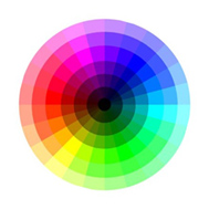
To make it easier to tell the colors apart, it is best to use colors that aren’t adjacent to each other on the color wheel. The color wheel provides a visual representation of color interaction:

A color wheel
What’s more, colors that are next to each other on the color wheel create a sensation of balance for the eye, due to the absence of contrast. To choose harmonious colors:
- Select colors with the same hue and similar tones,
- Or mix complementary colors. If you need two colors, choose ones that are diametrically opposite to each other on the color wheel. For three colors, choose those that would form an equilateral triangle within the wheel, etc.
Use identical colors to group elements together and different colors to distinguish elements that have different functions.
Avoid using red and green to define the borders between objects: 8% of people have a visual deficiency that makes it impossible for them to distinguish between these two colors.
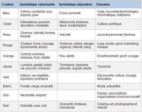
Color choice should also be guided by convention and any associated symbolism to convey the intended message. For example:
- Red = danger, so make sure you only use it to emphasize urgency,
- Yellow = warning, so you could use this color for warning messages
- …Etc.;

The cultural significance of different colors in the West
Managing contrast
High contrast is essential between the text and background of a web page. Maximum contrast is achieved with black characters on a white background, so this combination gives the best results. It can be subdued with a grayish background.
The combination of white characters on a black background takes 10% more time to read, according to a study conducted by Wendt in 1994.
One way to compensate for a lack of contrast is to use bold letters to highlight important information in the body of a text.
Choosing fonts
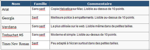
Some studies suggest that using a sans serif font makes text easier to read on the screen. Serif fonts can very quickly become annoying to the reader. It is always best to use fonts such as Verdana or Arial, which were created especially for reading on the screen. Georgia is the only serif font that is suitable for the web. The Trebuchet and Lucida Sans fonts can be seen on the Web, but they are usually only used for headings.
Generic fonts have the advantage of being recognized and used by all web browsers:

Generic fonts used on the Web
To emphasize a word, put it in bold instead of using all capitals. All capitals are difficult to read and on the Internet they are equivalent to shouting. A study conducted by Karen Schriver shows that a text written in all capitals is read 13 to 20% more slowly:

Likewise, do not underline text to emphasize an idea: in web standards anything underlined is a hyperlink.
Writing in italics should also be avoided, because it reduces reading speed. When it comes to quotes, for example, follow conventional usage by increasing the font size.
Choosing the right type size
It is difficult to find a type size that is suitable for all users. For your web page, use relative type size rather than defining points or pixels. This allows users to adjust the size of the type to their own needs.

Two icons are displayed at the top of an article so that users can change the size of the characters on the screen (Source: lequipe.fr)
Managing blocks
The ideal length of a line of text seems to be between 55 and 100 characters per line. Be careful when using elastic design, as on very large screens lines that are too long can become unreadable once the browser is maximized.
It is important to include white space on the page, with sufficient interline spacing and without giving the impression that lines of text are just floating on the page. By default, web browsers typically set their interline spacing to 120% of the font size. According to typographers, a correct interline spacing should be between 120 and 150%.
To check your interline spacing, locate the point where the ascenders and descenders meet between the lines. Make sure to also look at any capital letters with accents:

The idea is to combine all of these factors and determine how each can improve the readability of your content. Your choices will be influenced by the image of your site, the type of information you want to highlight and the characteristics and habits of users.
